Tom Tran
World Diet and Cuisine Map by Machine Learning Algorithm
Using clustering algorithm, I created a map based on per capita consumption data including vegetables, seafood, beef, pork, poultry, etc.
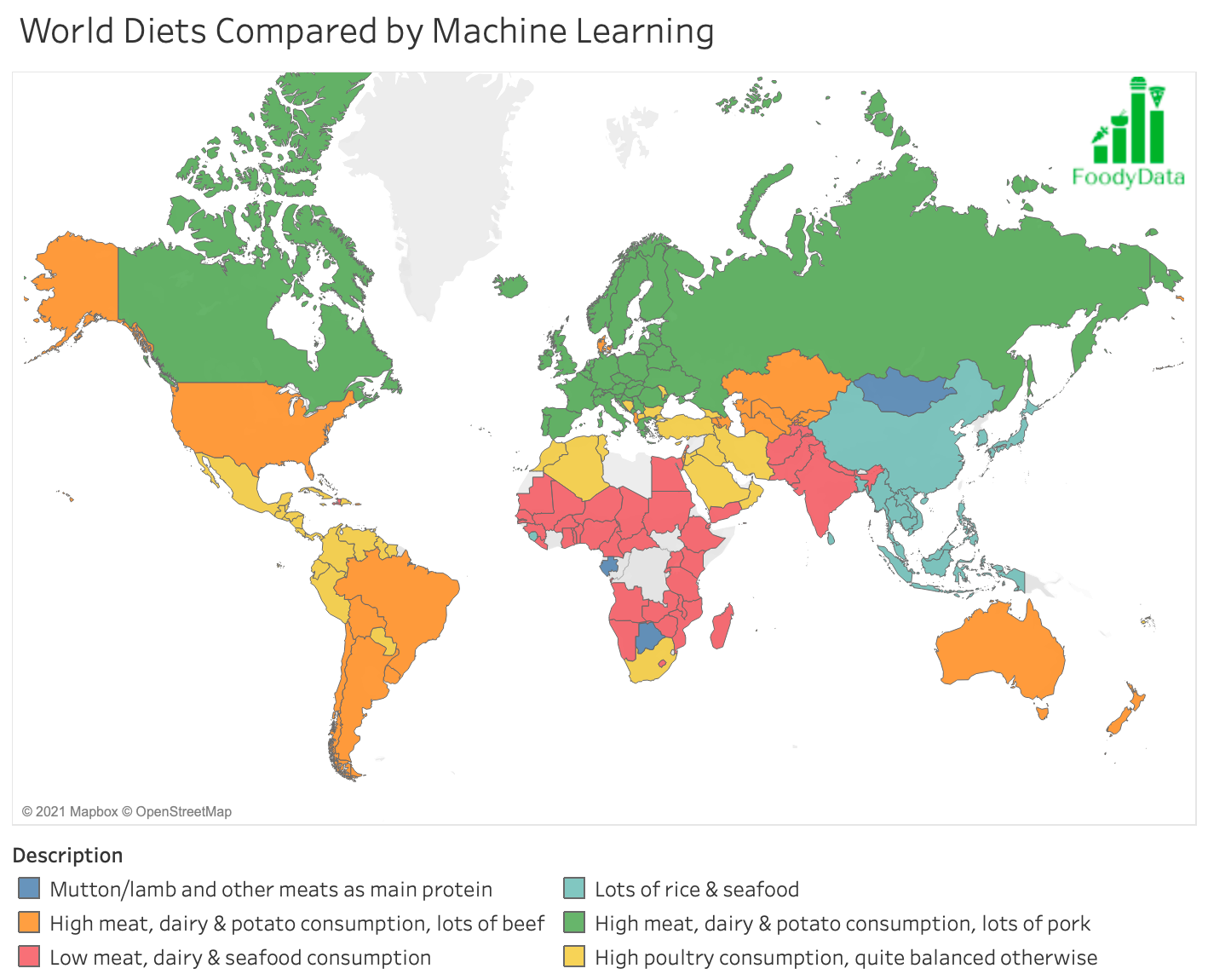
The result seems very sensible. The groups are:
2. USA, Australia, Brazil, etc.: The obvious burger, steak and fries with a lot of beef, diary and potato. Overall, very high meat consumption of most kinds.
3. India, Pakistan, most African countries like Nigeria, Ethiopia, etc.: Low meat, dairy and seafood consumption of all kinds and higher in consumption of vegetables.
4. East and Southeast Asia: A lot of rice and seafood consumption.
5. Canada and most of Europe: Overall, very high meat consumption of most kinds, especially pork. Also high on dairy products and potato.
6. Central and South America, the Caribbean countries, a few Middle Eastern and European nations, Northern African countries: High poultry (e.g. chicken) consumption, quite balanced otherwise.
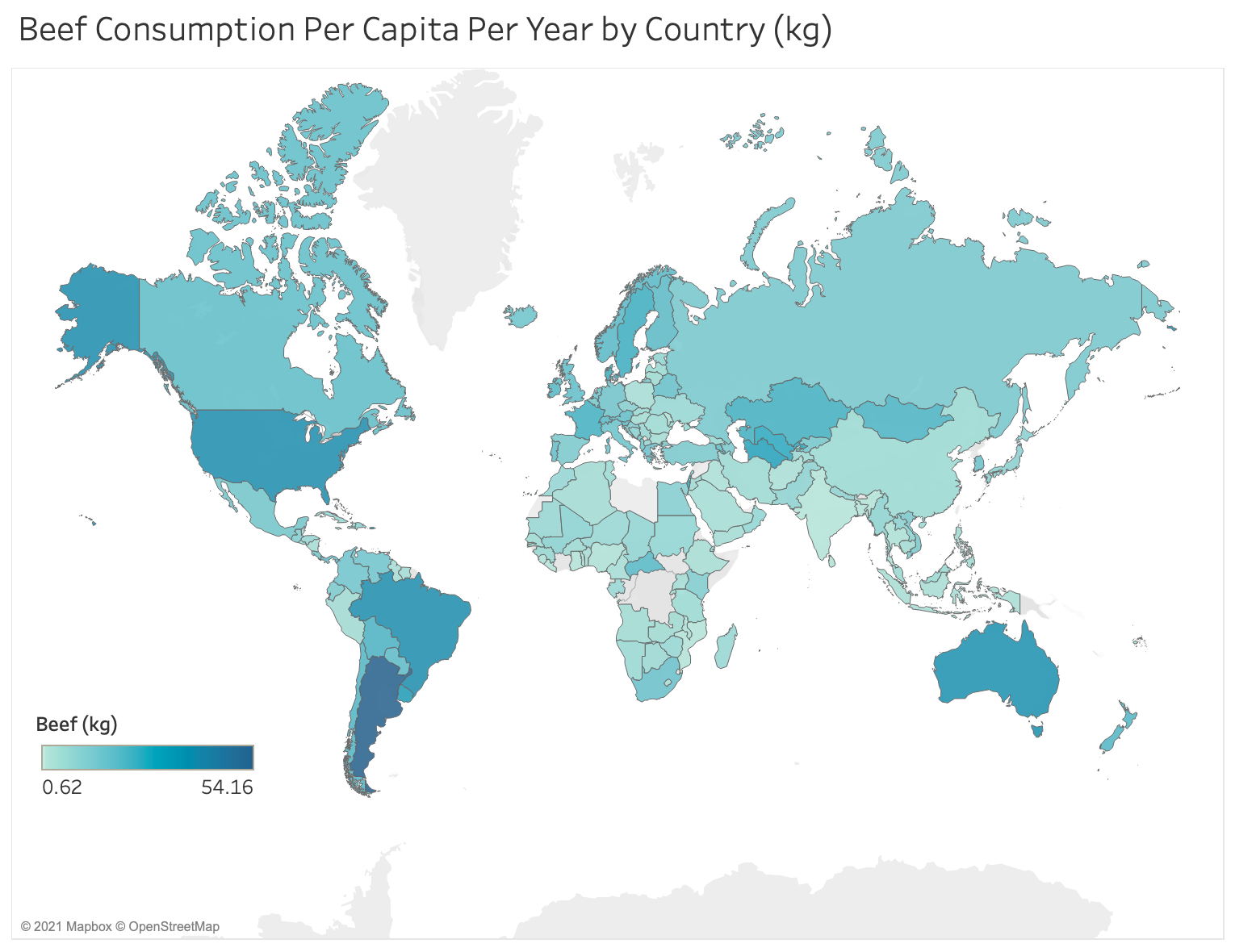
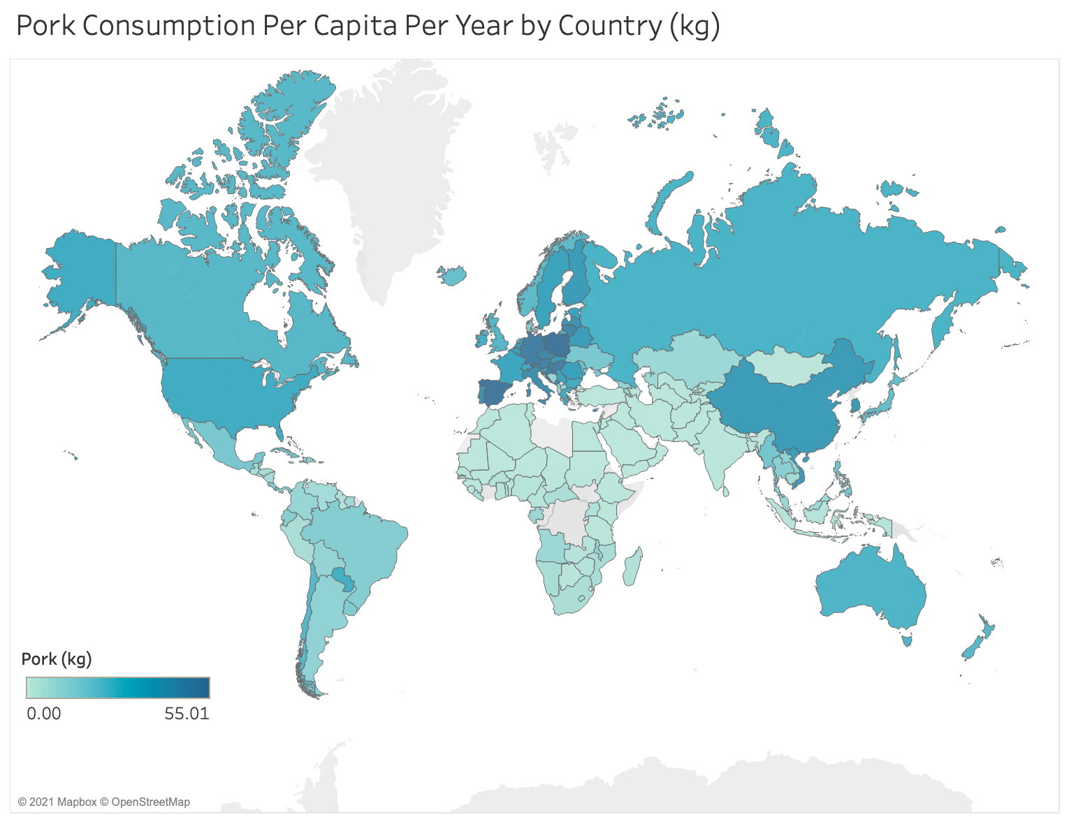
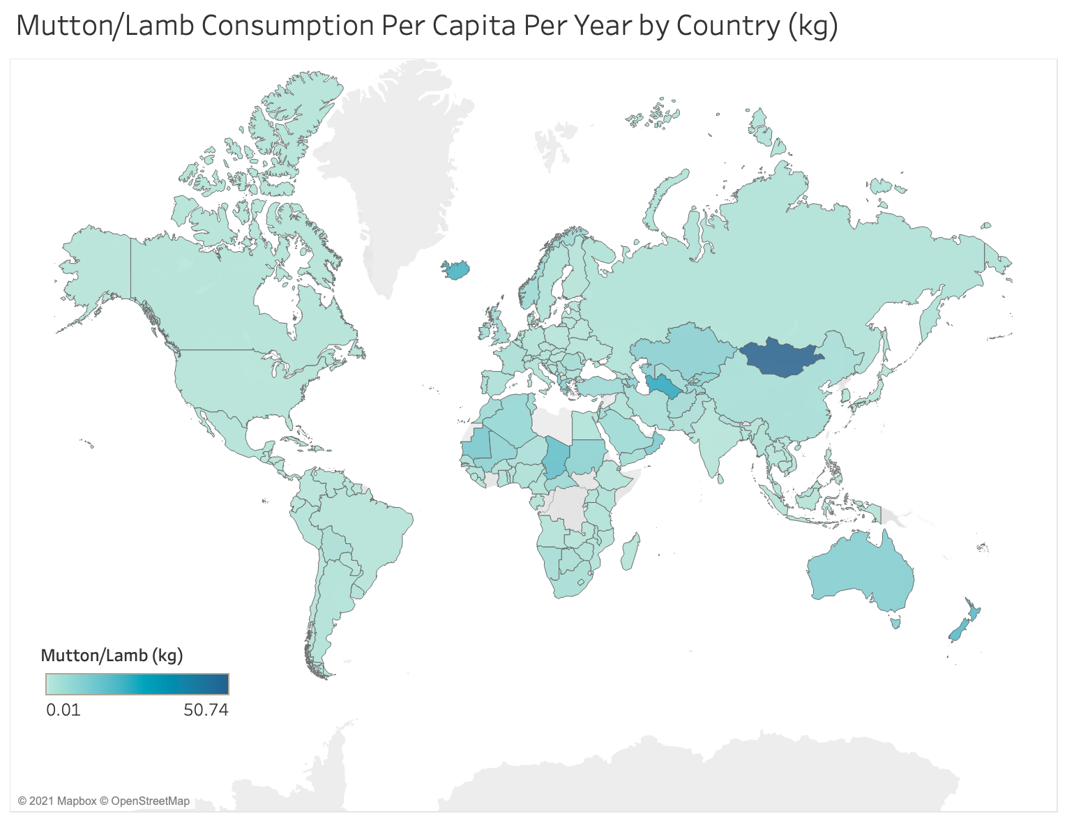
Below are a few maps of the food consumptions per capita.
Argentina has the world’s highest beef consumption per capita.
Poland has the world’s highest pork consumption per capita.
Mongolia has the world’s highest lamb/mutton consumption per capita
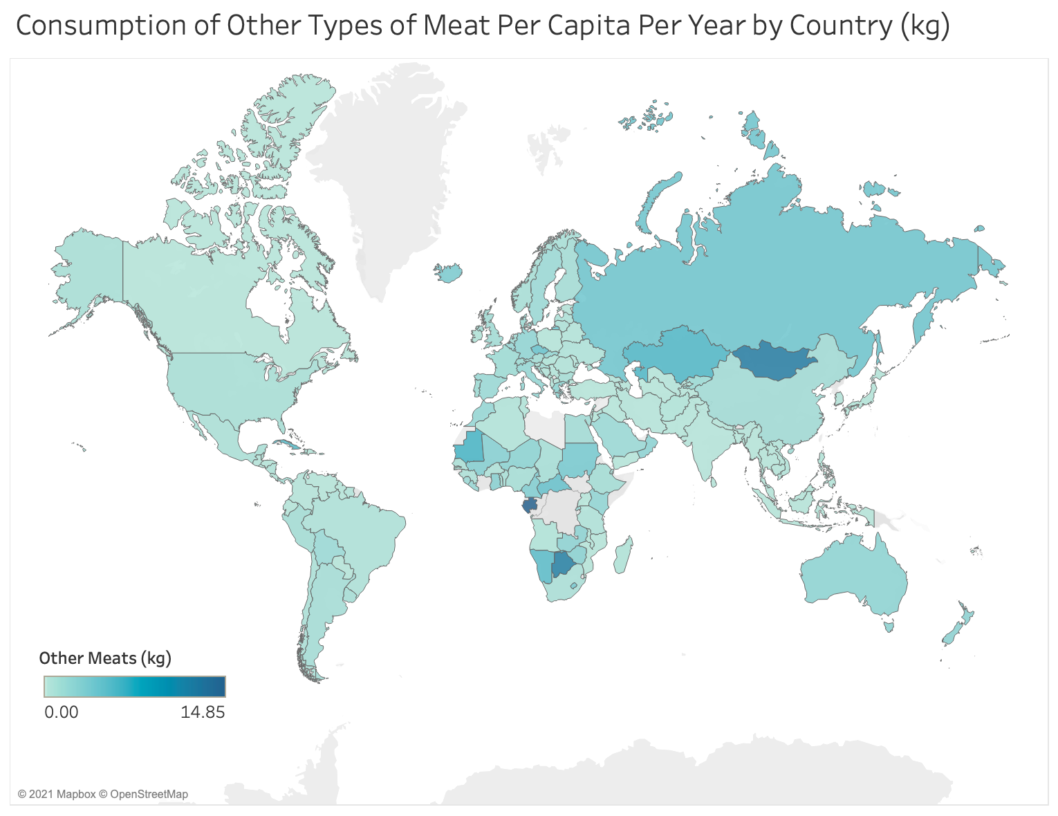
Gabon has the world’s highest consumption of other meats per capita.
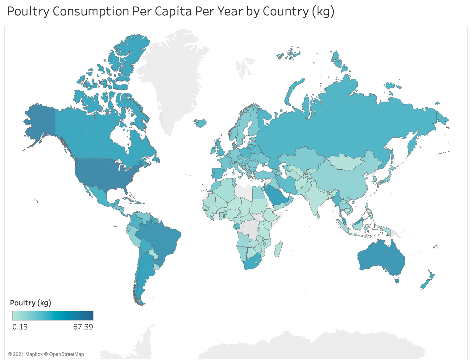
Israel has the world’s highest poultry (chicken) consumption per capita.
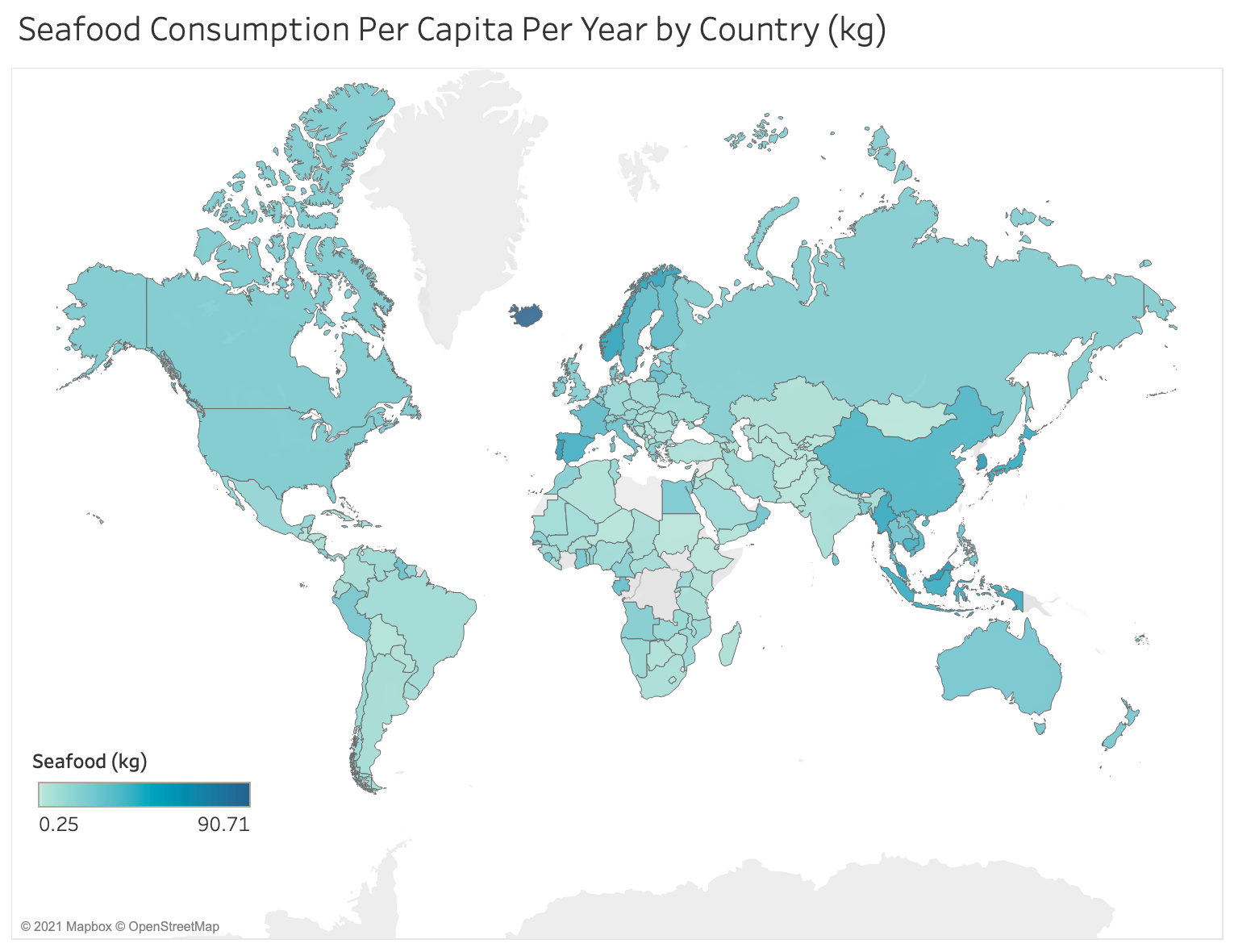
Iceland has the world’s highest seafood consumption per capita.
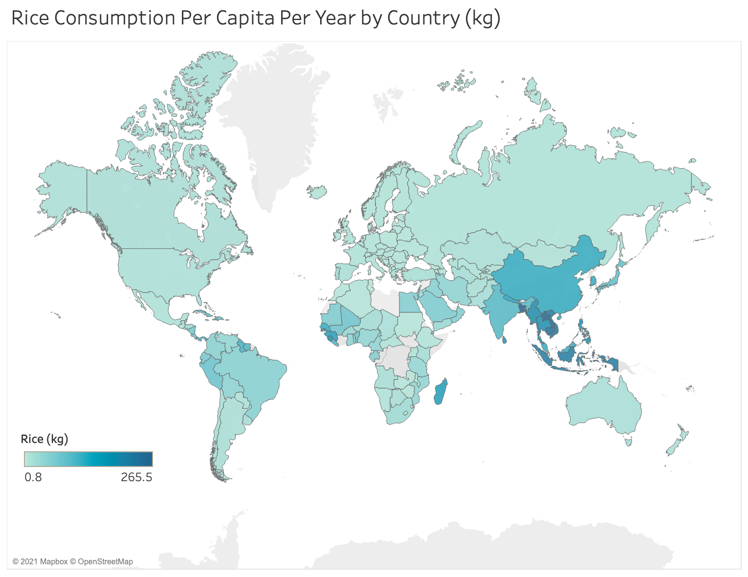
Bangladesh has the world’s highest rice consumption per capita.
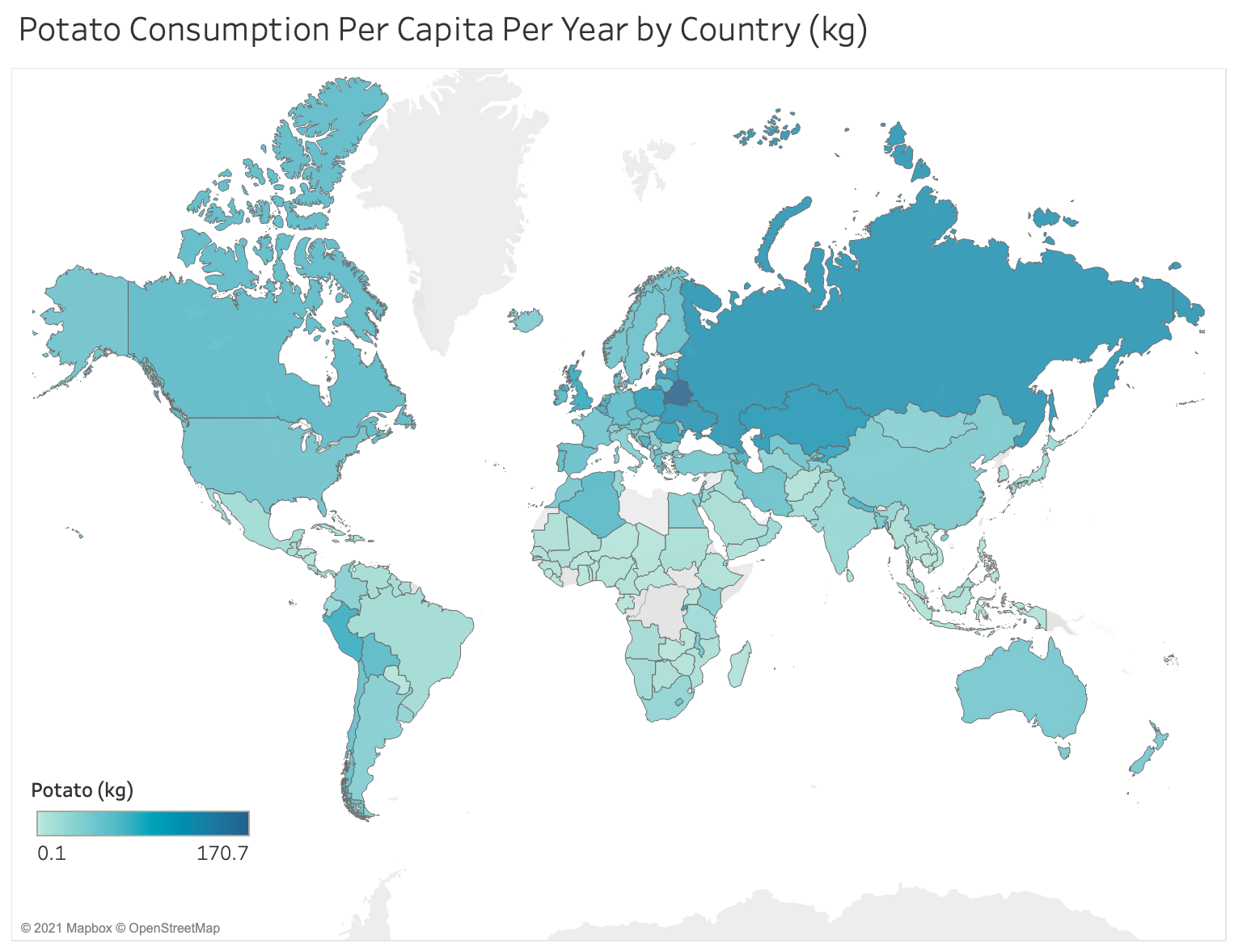
Belarus has the world’s highest potato consumption per capita.
Source: https://ourworldindata.org