Tom Tran
Updated: Sep 11, 2021
Is there correlation between Waffle House locations and heart diseases?

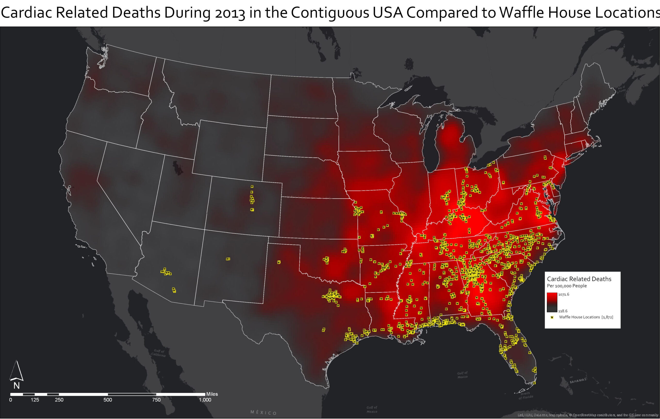
Remember this map? It shows Waffle House locations in relation to cardiac death rate. Posted on reddit, it gathered a massive amount of upvotes and still remains one of the most popular posts on /r/dataisbeautiful. However, this turned out to be some kind of a hoax or a joke.
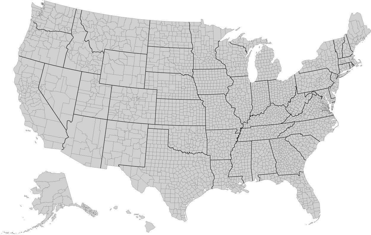
The problem with this map is the chart type. The author used a density (heat map) chart, which is misleading due to the counties on the East side being smaller and denser than the West side i.e. they are not equal in size. (The heart disease metric is by county). This is the map of the US counties.

So when the author created a density map, the points close to each other would naturally look denser, creating the illusion that there are more cardiac deaths on the East side.
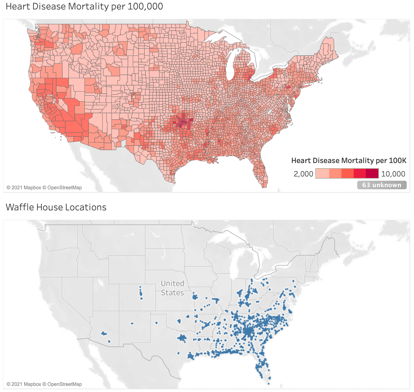
The correct chart should have looked like this:

This chart does not show correlation between Waffle House locations and cardiac death rate. A lot of counties with high death rates in Michigan, New Mexico, Nevada and California don’t even have any Waffle House locations. Oklahoma has spots of highest rate, but does not have half as many locations as Atlanta. So, the myth about Waffle House and heart attack is finally busted.
Source: CDC, POI Factory.